successor to Shock and Awe whose feed no longer seems to be working properly - original blog + archive remains here: http://shockandawesimonreynolds.blogspot.com/ ^^^^^^^^^^^^^^^^ the blog of the Simon Reynolds book about glam and artpop of the 1970s and its aftershocks and reflections to this day
Interesting reflections on the Robert Elms book Blitz: The Club That Created the 80s over at Michaelangelo Matos's substack Beat Connection
Although he takes a poke or several at the Elmscentricity of the Bob universe ("has no problem tooting his horn") and he firmly sides with the ravers against the nightclubbers ("I.... have no patience for anybody’s door policy"), Matos is more generous to this kind of "I'm-in-with-the-In-crowd-ism" than I am.
Perhaps geographical distance, and not having to live through it in real-time, accounts for it!
He satisfyingly skewers the Elms assertion that Rusty Egan invented modern deejaying (drily pointing out that Egan used just one turntable).
Also satisfyingly skewered is the strained Elms argument that New Romanticism was not in ideological lockstep with Thatcherism. Regardless of who they actually individually voted for in 1979 or 1983, the whole slant was escapism combined with make-it-at-all-costs (with a strong vein of fake-it-till-you-make-it in there too).
Matos mentions and highly recommends a doc I have never heard of: Soul Boys of the Western World:
"It it goes over the sun with the Blitz footage. This club took place in a Soho dive bar, and when the camera sails through it in this film, the walls pulse. It’s the most alluring thing I’ve ever seen in above-board filmmaking. I wanted to enter it and not leave. Within seconds, everything I’d ever read, or written, about the place came suddenly to life."
While I shudder at the idea that this is an entire documentary devoted to Spandau Ballet, I might have to steel myself and watch it.
^^^^^^^^^^^^^^^^^^
Earlier bloggige o' mine about Blitz and about Bob.
There's an exhibition at the Design Museum in High Street Kensington dedicated to the New Romantics and the club scene of Blitz and Billy's and Le Beat Route. On a recent visit to London I checked it out.
I thought it was well done, informative, and fun - worth a visit for sure (it's running until March 2026).
But, but, overall it did rather confirm my Secret Thesis about glam, which applies equally to all the neo-glam echoes (New Romantics / Futurists, Romo, electroclash).
Which is that the sonics are more enduring than the sartorials.
(Okay that doesn't work with Romo but with the others, definitely).
Take the tunes by Visage that you can hear-see in the videoscreen area.
Not only do "Fade to Grey" and "The Damned Don't Cry" sound better than their videos look, but New Romantic music generally has aged much better than New Romantic style - judging by the clothes displayed on mannequins in this exhibition, or the graphic design of the magazine covers and spreads framed or glass-cased for your discerning eye's delectation.
As for the disparity between how Bowie and his accomplices sound on "Ashes To Ashes" and how he's togged up in the video...
Bowie and choreographer Toni Basil hanging with his progeny, scouting for talent maybe for the "Ashes to Ashes" promo
Actually, in truth, the Visage promos weren't so bad - "Damned Don't Cry" especially is budget-Visconti stylish. And even "Vienna" by Ultravox, which I hadn't liked at the time, sounds and looks quite grand in its gauche way.
But overall the gap between the visuals and the aurals reinforced my Undeclared Thesis. With glam and its descendants, the clothing / coiffure / cosmetics, once shocking or startling, very soon becomes:
a/ dated
b/ revealed - more often than not - as garish, over-done, and even surprisingly tatty.
Almost timelessly elegant... almost...
"I'm so weird"
That's the young Boy George I believe, looking gaunt, snapped for a Blitz Culture feature in ZG, the house journal of St Martin's College.
Now the clothes in the right-hand pic are quite cool in a mid-70s Doctor Who, "royal court of some distant alien civilization"way...
Okay this is chic - both the sketches and the photo - almost worthy of Jean-Paul Goude
Again, this zany zany spread above reminds me of the "Slave to the Rhythm" video
Whereas - and granted I couldn't design my way out of paper bag - this is a bit of a mess. I suppose it must have seemed like an energy-burst at the time.
In contrast, this pair of flyers are just "huh?"
This is how you represent the super-stylists place-to-be-seen?
Again, was this really designed to make people think "this is where I want to be"?
"I'm in with the in-crowd"
This is striking, yes... and I covet the early iDs (and appreciate their 'street fashion' approach, kids caught on camera in the wild, self-fashioned looks rather than boutique-bought) and piningly wonder why no one has scanned all of them and put them out there on the internet commons (you can find the odd early-issue online, some incomplete issues and stray spreads... to buy the intact originals on Ebay or from a vintage magazine seller online would be astronomic)
"& sweat is best" - I think "sex & sweat is best" was a slogan coined by iD co-founder Perry Haines... maybe adapted from Sex Sweat and Blood, a 'new danceability' compilation, on which his track "What's Funk" featured
Of all the garments on display, this struck me as perhaps the most chic - I do like that little outline figure of a man near the hem, the diagonal double-lines, the belt, and just the nacreous gleam of the fabric (albeit something of a lobster-y hue).
This though just seems a bit drab and boxy.
I do like the sort of leafy fabric texture here
Whereas this just looks unflattering. If not for the quasi-military insignia on the collar and the arm, it looks a bit pants-suit executive woman.
Sort of avant-frumpy
This one is from a spoof by the Not the Nine O' Clock News crew, but actually no worse than many of the things you might have seen in the clubs, or in the real-deal videos
"Nice Video, Shame About the Song"
Lufthansa Terminal, haha
This one is pretty cool as echt-New Wave graphix
Draft for Robert Elms sleeve note to Spandau Ballet's Journeys to Glory.
Now I had assumed the exhibition was in tandem with the Elms bookBlitz: The Club That Created the 80s. But it seems the Design Museum have their own book / catalogue they are touting: We Can Be Heroes: The Blitz Club - Where Style Was Born, co-authored by Blue Rondo man Chris Sullivan and Graham Smith (although there is an intro by Elms, along with no less than three forewords - by Boy George, Gary Kemp and Steve Strange (from beyond the grave??)). As for the exhibition itself, that was curated by Michelle Thom.
Probably the best thing visually in there was a contemporary work - a simulation of what it would have been like to be amidst the bustling poseurs at Blitz, as the club gradually fills up. Improved mightily by its sort of faded-by-time, mists-of-memory effects.
There's a sort of doubling of retro, or of nostalgias, effect looking at this simulacrum because the original club Blitz was - immediately before being taken over the poseur posse - a 1940s / WW2 themed club, hence the propaganda poster decorations.
I wonder if the proprietors straight up nicked the idea from the 1976 episode ofRock Folliesthat features a Forties revival club called The Blitz, with air raid wardens as waiters, rationing-style food (cold spam, potato pie, tripe and no onions), gas masks, etc, and in which the Little Ladies perform as The Victory Girls singing songs about the war effort and how Glenn Miller's plane has gone missing. From about 36.52 mins in.
A virtual Rusty Egan on the wheels of steel
Unlike a similar diorama I saw of CBGBs in a New York museum that notably failed to reproduce even a scintilla of the squalor of the original venue, with the ersatz Blitz there were ash trays with actual cigarettes in them - well, one cigarette that had been lit but evidently not smoked. Still, points for effort on the historical veracity front. Even the most stylish of clubs were rank places, chokingly thick with cig smoke, drink spillage staining the tables and sticky on the floor....
Talking of simulations...
Blitzblogger!
They have this clever machine that takes your picture and makes you look like a New Romantic
In this rendering, I resemble more a Buggle.
The interloper!
After feeling my bitchery build up inside and form itself into a future blogpost as I walked through the exhibits, I was secretly touched to find myself included among the gift shop offerings, even though there's only one chapter in Rip It Up that touches on the New Romantics
Shock and Awe would have sat better in this context, in truth - despite its Secreted Thesis.
NME cartoon circa 1981 nicely skewers the self-declared aristocracies of club culture
Apropos
Oh the myopic narcissism of the young! Or in this case, the once-young....
Of course there was rather a lot more to the Eighties even within the narrow realm of trendy clothes worn and trendy sounds danced to than what went down at Blitz
A preponderance of right-time-right-places... and we won't even get on to rock's claims on all that
I'm sure it's just a subtitle to sell books and he doesn't actually believe that Blitz set the template for the entire decade.
Would be tragic if he did...
In The R.Elms of the Senseless.... Actually I don't mind his Face-era writing at all - a naturally gifted rhetorician, in full command of those cadences that announce "listen up, I'm about to hip you to the score", carrying you along despite yourself.
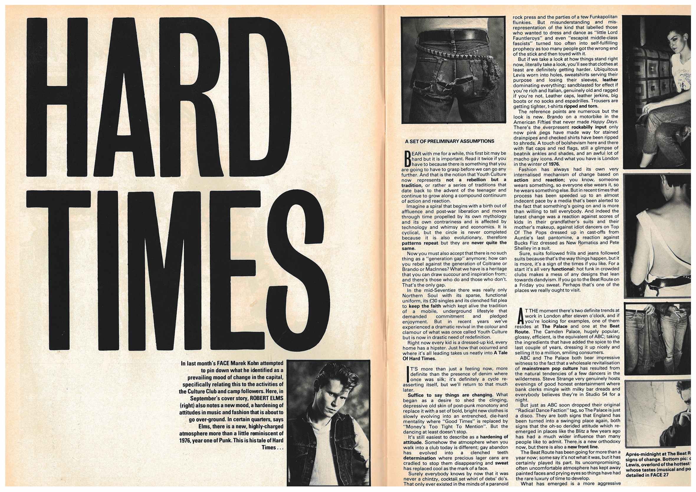
The Hard Times piece, while risible in its complete reversal on Blitz-escapism, is a rhythmically exciting read - redeemed (or at least, made effective) by the sense that he really does believe it, in the moment of typing.
Then there was another turn of the cycle - Hard Times (clubbing as political, deejays as militants, torn jeans as recession wear. "Money's Too Tight To Mention") was followed a few years later by Good Times (not quite an overt celebration of casuals and their expensive sweaters but it does say "money is in")
NME cartoon from 1983 skewers the Hard Times concept
The concept of "Style" discussed on the Oxford Road Show by Elms, Annie Clayson and Peter York (who opines that "Money is stylish")
Talking about self-declared aristocracies
“Picture angular glimpses of sharp youth cutting strident shapes through the curling grey of 3 am. Hear the soaring joy of immaculate rhythms, the sublime glow of music for heroes driving straight to the heart of the dance. Follow the stirring vision and rousing sound on the path towards journeys to glory.”
That's Robert hymning Spandau on the back cover of Journeys To Glory
Prototype draft for the Journeys to Glory notes (via the Blitz exhibition at Design Centre)
The 1980 NME live review (no worries about conflict of interest in them days! he'd only named the band.... ) that launched it all
"Their strident elitism means that unless your ears are pinned firmly to the 'right' ground your chances of seeing them are at present slim. On the evidence of their latest performance it really is your loss"
The stringent obsession with absolutely correctness - the minutiae of distinction
Love this idea that Bowie copied them, the boys from Burnt Oak!
NME pisstake Elms's I-wanna-Face-of-me-own venture New Sounds, New Styles
A novelist, yet... Wilde gives him a hard time, boom boom
^^^^^^^^^^^^^^^^^^^
In the Eighties, I used to think of the style bibles as the enemy but I read them avidly - well they had loads of good writing, including a lot of people who once used to write for NME and the other weeklies. The Face had some of the sharpest columnists around - Savage, Burchill, Marek Kohn.... and the super intellectual team of Steve Beard and Jim McClellan, who seemed to oscillate between The Face and iD.
And in truth I would have been happy to write for them and in fact did write for iD, sporadically in the second half of the Eighties, and then after a pause, again a few times in the '90s. (Eventually I did write for The Face too - in the 21st Century). (Oh yes and well before that, in the early 90s, I did some stuff for Arena - which was a sort of men's magazine offshoot of The Face, yet another Nick Logan invention with Neville Brody design).
In the 1980s, the style bibles were useful adversaries, ideologically speaking. They beamed out this fantasy of metropolitan chic and rock-is-dead eclecticism - the idea that there's a place where it's all happening, an in-crowd subworld - they beamed this dream out to hair salon owners and aspiring
fashion designers in the sticks.
We at MM pushed our own quite different fantasies.
The thing that surprised me when I went around to the iD office, which was then quite near Melody Maker, Drury Lane / Holborn, is just how shabby and cramped it was. Melody Maker was incredibly messy but it was quite a large space. And quite bustling. The iD office was empty apart from the editor Dylan Jones and assistant editor Alix Sharkey, whose face I recognised from
fronting the Morley-hyped but spectacularly null funk outfit Stimulin.
iD staff plus Chris Sullivan of Blue Rondo A La Turk plus Robert Elms plus Peter York all have cameos in this bizarre Arena film about Eighties ligging at different strata of society
And apparently it was much the same with the Face in its first decade or so - a shoestring operation. Not the chic salon-like place that the design and the look of the magazine would suggest.
Both magazines were done on a meagre budget yet managed to concoct this mirage of hip London that they transmitted all across the country and indeed internationally. (Joy bought both religiously).
If you look at an old issue now, especially early on, you can see how Face and iD were cobbled together in a last-minute dash just like the music papers. All kind of no-hope chancers getting featurettes, completely forgotten groups and motormouth types hawking something or other.
I remember Kodwo Eshun - I had no idea then who he was going to become! - came up to interview me (supposedly for the Oxford student mag Cherwell - I think he just wanted to meet). During a lively conversation at an outdoor table in Endell Street, he expressed disappointment that we hadn't gone straight from Monitor to The Face and iD. Like it hurt him to have to pick up a copy of Melody Maker every week, this broadsheet that left ink on your fingers.
But I rather liked the idea of operating from this supposedly clapped-out, obsolesced institution, going against the grain of times. (When the grain of the times was things like Absolute Beginners).
Besides, the format was in alignment with what we were pushing - a resurgent rock underground.
Also the music papers came out 51 times a year, whereas the style mags came out monthly. So there was just vastly more space for our verbosity to frolic in.
I should imagine it was very hard for a freelancer writing for a style magazine to make enough to live on, given you only have 12 paydays a year. And I seem to remember the iD word rate was modest, no better and possibly worse than the frightful word-rate at MM. At MM, if you were prolific and voluble, you could make a nice living as a freelancer, simply because there was so much space to fill.
The 51 issues (Xmas a double, lasted a fortnight) enabled you to construct more of an ongoing world.
That's what all these magazines were about - world creation, world maintenance.
I miss that. Is there any publication today, print or online that does that?
Well, No Bellsdoes. They have meet-ups, events where people read music criticism aloud. It's a social space, not just a disembodied discourse space. The magazine is a locus of vibe.
Talking of style bibles, on a recent trip to New York, we went into a store that was choc-a-block with magazines into cutting edge fashion. Sort of modern day equivalents to iD and Face (both of those still going of course, as print entities - and bigger than ever in a literal sense - each issue is a monstrous paving stone of glossy fashion spreads, adverts, something you could injure yourself with if you picked it up without bending your knees properly, or injure someone else with, if wielded as weapon.)
I was staggered by how many of these style magazines there were - piled up everywhere, not an inch of space in this hipster newsagent I guess. From all over the world, with Steve McQueen-esque ugly-as-beauty images on the front.
Rather like with art books, I wondered what the financial and production logistics are when doing a magazine like this - quality paper stock, full gloss ultra-vivid images. The bottom line.
Do all the photographers and models and make-up and styling people just work for free in the hope of furthering their careers?
Advertising must bring in some money, from fashion and beauty products and trendy shit. But the cost of doing something so luxurious looking and feeling, and in presumably quite small print runs, must be enormous. And then the physical cost of distributing something so bulky. The shops must take a hefty mark-up given the amount of sheer volume each issue takes up.
Also rather like with art books, I wondered who actually buys these things,... They seemed to be retailing anywhere from $20 to $40 bucks each. I have a mental block with paying that for a magazine.
So I guess very rich people, or cutting edge fashion obsessives (same difference?).
And they doubtless function less as something to actually read and more like a coffee table book. Something to flick through desultorily or just have sitting there.
Still mystified by the title of this sports-as-style-microculture magazine
^^^^^^^^^^^^^^^^^^^^^^^
Paul Oldfield fires a salvo at The Face on the occasion of its 100th isssue.
Wandering around NYC I was amazed how saturated everywhere was with fashion advertising. I mean, yes it's always been there, but it was really kind of total in places like SoHo. Enormous, glossy images. Everything hyper-real and supersaturated. Often on LED screens rather than just posters.
Was also startled by the fashionization of Dr. Martens
I remember in the 1980s having to going to a rather poky, plain shop next to Camden tube station to get DMs. The kind of place that would do shoe repairs and cut keys as well as sell shoes. (Actually I might be imagining that aspect but it certainly had nothing fashion boutiquey about it).
DMs were "cool" through the skin and punk connection, but they still had some kind of residual currency as practical footwear, the kind of thing someone who worked in a factory or on a building site might wear for protection against things falling on the foot.
I expect this chic-ification has been going on for a while and I hadn't noticed.
Our kid asked for a pair of DMs some years ago and only wore them once - I was furious. They cost about $130.
Carlyle had this type figured a century plus earlier
"First, touching Dandies, let us consider, with some scientific strictness, what a Dandy specially is. A Dandy is a Clothes-wearing Man, a Man whose trade, office, and existence consists in the wearing of Clothes. Every faculty of his soul, spirit, purse, and person is heroically consecrated to this one object, the wearing of Clothes wisely and well: so that as others dress to live, he lives to dress. The all-importance of Clothes, which a German Professor, of unequalled learning and acumen, writes his enormous Volume to demonstrate, has sprung up in the intellect of the Dandy without effort, like an instinct of genius; he is inspired with Cloth, a Poet of Cloth. What Teufelsdröckh would call a 'Divine Idea of Cloth' is born with him; and this, like other such Ideas, will express itself outwardly, or wring his heart asunder with unutterable throes."
^^^^^^^^^^^^^^^^^^^^^^^^^^^
R.Elms makes a cameo in this report on Marxism Today's 1986 conference on the Left's problem with style and hedonism for its own sake